Design Is Not Just About Intention
In the previous post, I showed a very unfortunate community poster. Let’s continue from that.
As designers, illustrators, and creators, we tend to think in terms of what we mean to communicate. We choose inclusive characters, warm language, and positive themes, and assume that if our intent is good, good outcomes will follow.
But visual communication doesn’t work that way.
The viewer doesn’t see your intention—they see shapes, relationships, and patterns first. Their brain immediately starts matching those patterns to things it already recognizes. This happens fast, subconsciously, and often irreversibly.
If a composition accidentally resembles a culturally loaded symbol, that association will snap into place before the viewer even processes your message.
Once that happens, it’s very hard to unsee.
Redesigning With Awareness
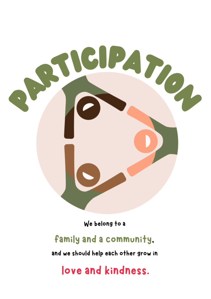
I reworked the concept with the same core idea: community, participation, mutual growth and support.
However, I changed the structure. Instead of four people, we have three, and instead of a serious discussion at the table, they are cheerfully holding hands. They might be laying on the ground, cheering, or jumping off with a parachute; the point is, they are doing it together, and happily so.
Because the original poster was used at a school, I made my redesign approachable, with round shapes and big smiles. I also made sure each character has a human skintone, unlike in the original.
And while I’m aware the triangle can be seen as a suspect sign as well, surely it lacks the lockstep associations the swastika has.
The message about community and mutal support didn’t change.
But Here’s the Twist
That triangle version isn’t immune either.
With a slight change in color and framing, the same composition can start to resemble something completely different: an upside-down pineapple.
A symbol that, in certain contexts, carries meanings that have nothing to do with community or kindness, at least not in a school context.
So if I had tried to go for an abstract sun-and-road-and-community idea, I would have ended up in Unintended Consequenceville again.
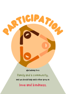
Nothing about the figures changed.
Nothing about the body text changed.
Only the surrounding cues did.
And suddenly, the interpretation shifted again.
Meaning Is Fragile
Unfortunately, meaning in visual design is not stable. It’s influenced by:
- composition
- color
- orientation
- cultural context
- the viewer’s prior associations
You can make thoughtful, careful decisions and still end up against unintended interpretations.
What This Means for AI-Generated Design
All of this is also why AI struggles with these edge cases.
AI image models don’t understand symbols the way humans do. They don’t have a built-in sense of “this shape might be misread” or “this carries cultural weight.” They generate images by following patterns; what tends to look like what.
So if a certain arrangement of shapes statistically resembles something else, the model can reproduce it without any awareness of the implication.
It doesn’t know it made something unfortunate.
It doesn’t even know what “unfortunate” means.
Which is why relying on AI alone for sensitive visual communication is risky.
AI is fundamentally unaware.
Design Still Needs Human Judgment
Good intentions matter, but they’re not enough.
Design lives in the gap between what you meant and what people see. And navigating that gap, like catching edge cases, anticipating interpretations, making adjustments, that’s still a human skill.
Even small changes can completely shift the message.
And sometimes, the difference between “warm community” and “deeply unfortunate” is just a few degrees of rotation.